Showing posts with label painting. Show all posts

Friday, 9 August 2019

Romano-British Cavalry Ride Out To Their Doom!

It's been two months since my last completed unit, but I'm back with some major progress. Eight Romano-British cavalry from Footsore to bolster my forces.


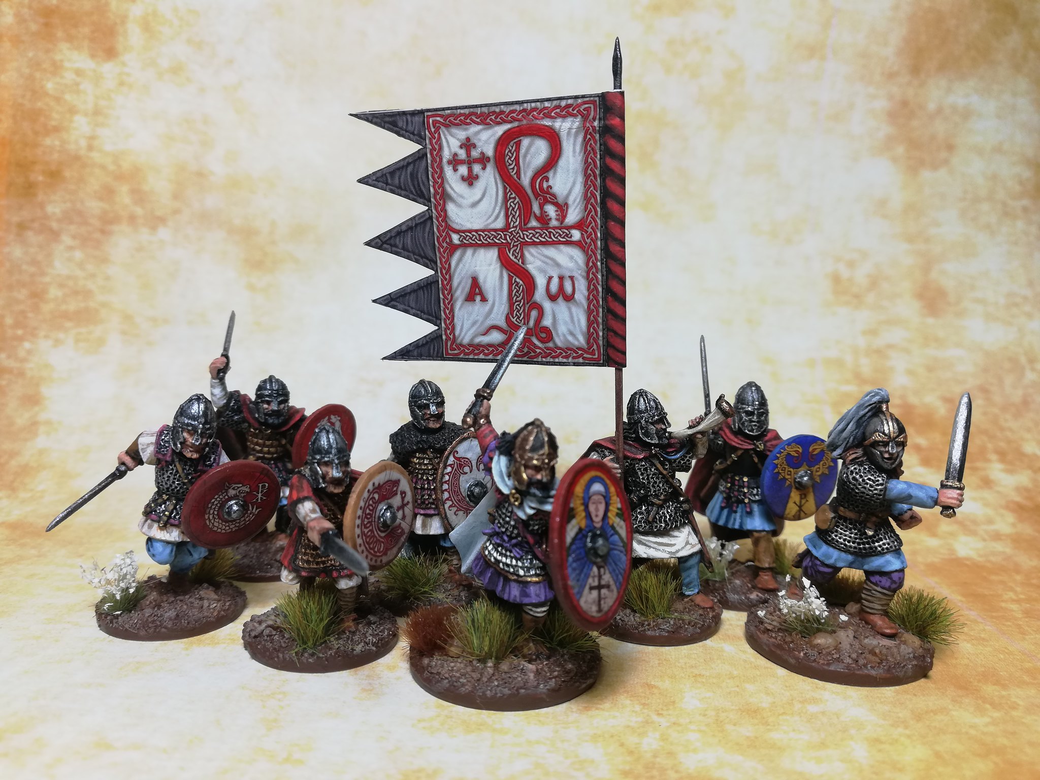
They'll serve as Hearthguard for SAGA, Noble/Ordinary cavalry for Dux Bellorum and mounted Men of the North for Dux Britanniarum. The latter role inspired me to draw on the early medieval Welsh poem Y Gododdin by Aneirin for inspiration for the colour scheme of the riders and their horses.

These are the first cavalry I've painted since some Gary Morley Silver Helms way back in 1998 - 21 years! :D


Back to history. There is a wealth of guidance for painters in the text of Y Gododdin which I've compiled below in case anyone is interested.

Y Gododdin

Costume Notes
Numbers in parentheses refer to stanza followed by line.

Broad lightweight shield (1:5)
Gold-bordered garments (1:8 )
Betorqued (many)
Mail-coat (3:7)
Lime-white shields (11:6)
Blaen took delight in gold and purple (16:6)
Gold-fretted shield (29:3)
Swift steeds and dark-blue war-gear and shields (33:2)
One who wore purple (67:4)
Ice-bright shields (71:13)

Horses

Roan (26:8 )
A trim long-legged grey (50:4)
Darker (brown) his saddle (50:6)
Grey steeds (58:11)
Red steeds (61:7)
White horses (74:5)
Dapple-grey steed (77:5)

What I finally settled on was a mashup of qualities drawn from the poem and Late Roman equipment. The "lime-white shields" were a must.


I had to make sure they didn't look too bright, flat or bland. I used a base coat of Foundry Quagmire B (a brown grey) and several thin coats of Canvas C (an off white). I tried to approach them as if I was painting lime onto leather-faced shields.

To give them more depth I weathered them with a drybrush of Quagmire B and Rawhide A. Tried a couple of shield cuts but my brush hand wasn't steady enough to get really thin straight lines done so well.

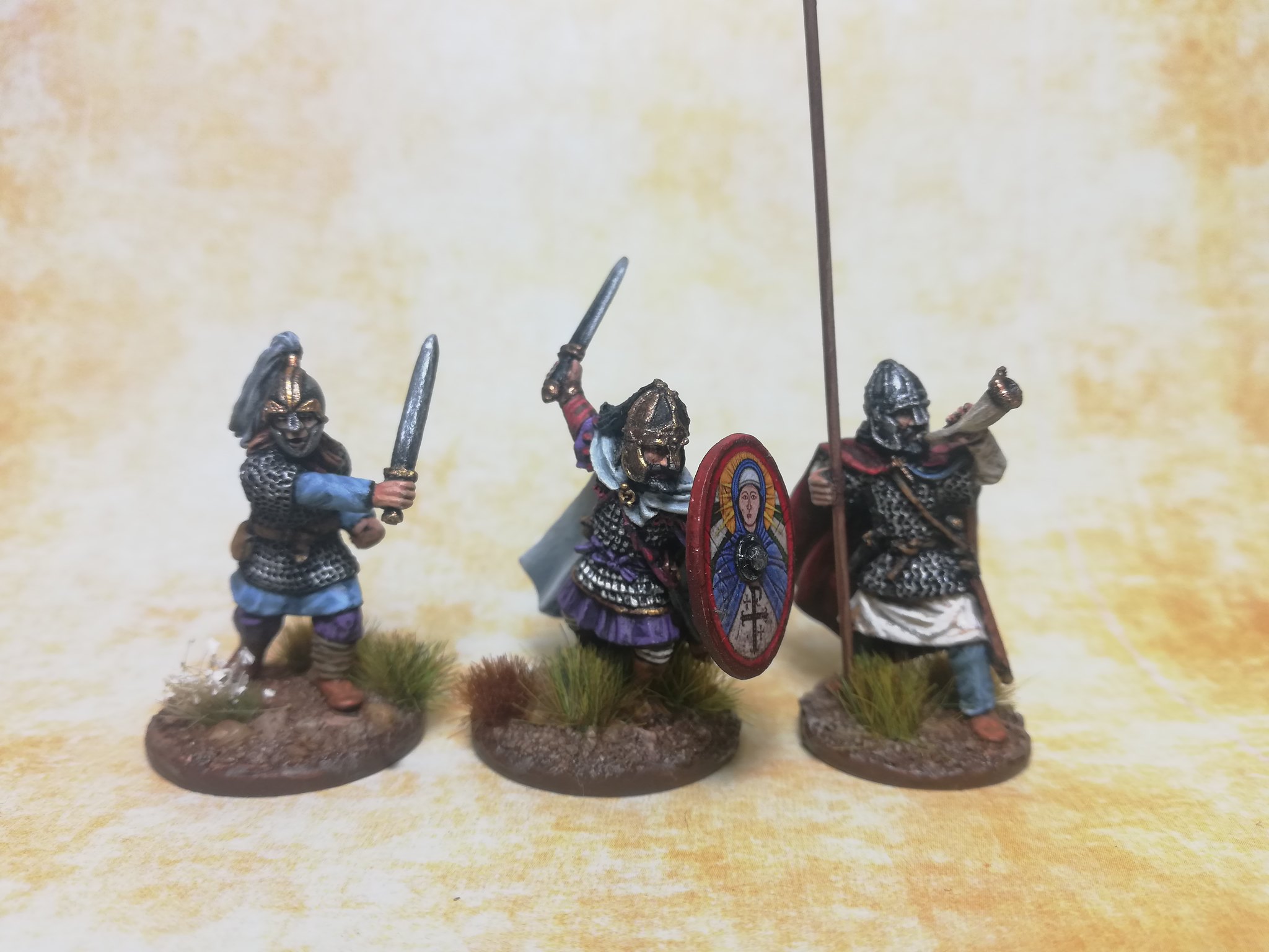
I also incorporated some "gold-bordered garments".


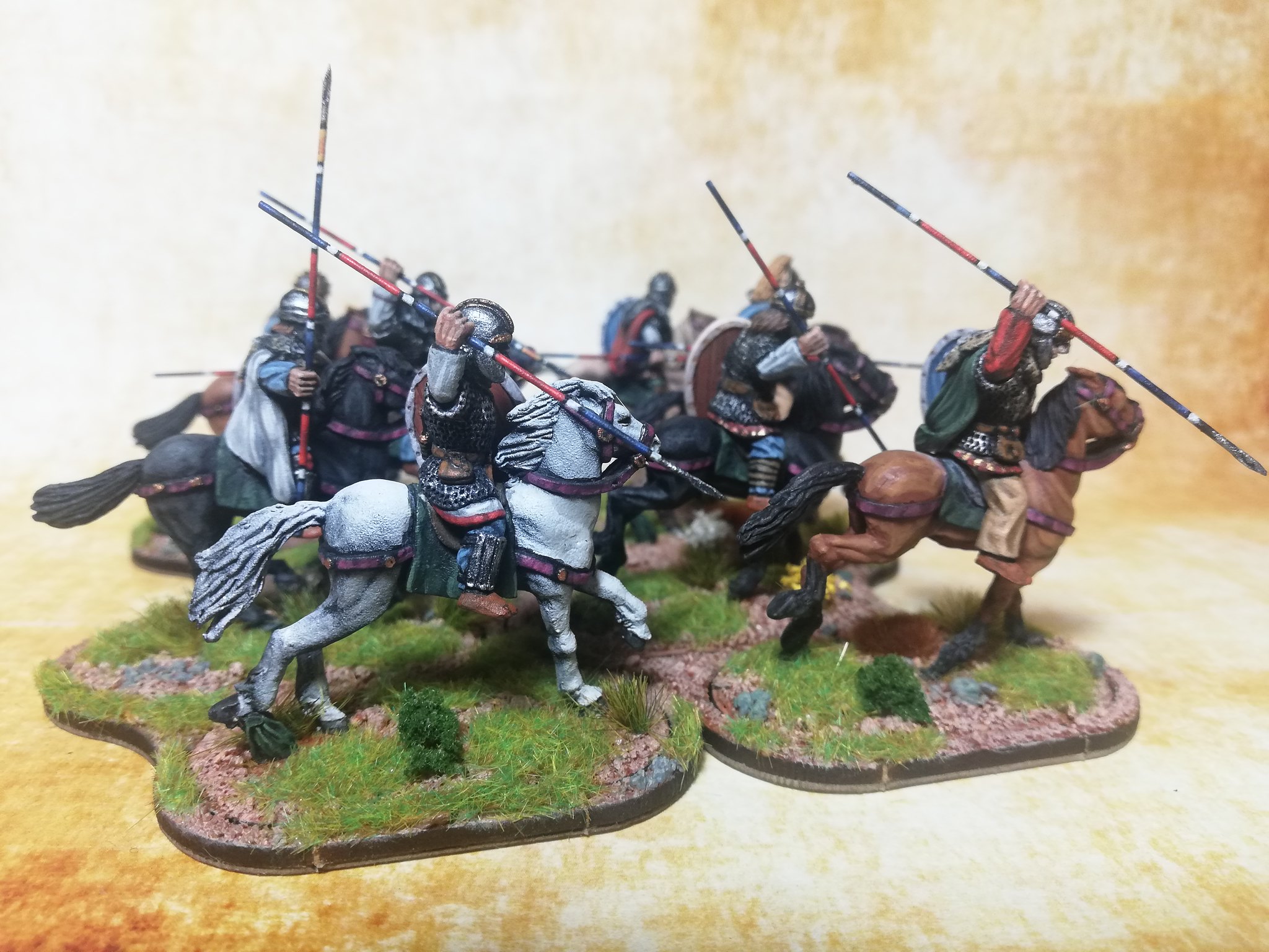
To give them some elite flavour I pimped up their spears with the stripes that seem to be a Late Roman thing (anyone know the source of these?).


Part of the painting challenge here was to produce sufficient variety in the colour schemes so that multiples of the same model looked different. Among the eight figures there are only six different riders and three different horses. Luckily, the notes from the poem really gave me an excuse to crack open many of the pots in Foundry's Horse Paint set.

I'd only painted dapple greys and whites before this so it was a nice challenge to attempt blacks, chestnuts, bays and a roan. The roan is the toughest to pull off since they have equal amounts of interspersed white and coloured hairs, something which you can only impart impressionistically in paint. While blacks aren't mentioned specifically in Y Gododdin, other Welsh literature mentions Arthur riding a black mare so I wanted to get some practice in before I painted the dux bellorum.

EDIT: I found that different painting techniques worked better for different horse colours, from normal layering (for the bays and lighter browns) to drybrushing (for the blacks) to zenithal for the greys.


Next up on the workbench is Arthur himself with the costume colours drawn from a mix of Bernard Cornwell's trilogy and the Mabinogion. The latter provides some names of Arthur's arms. I'm still trying to figure out what motif to place on his shield which was called Wynebgwrthucher (face of the evening). Perhaps a Celtic moon or star.

Thursday, 16 May 2019

Sabot basing - A Method

Since I'm playing a mix of games from those requiring individually-based models to element-based games, having sabot bases is useful to make the most each painted model.

I finally got round to testing out the sabot basing method that I've carried in my mind for months. I've documented it below as an aide memoire and in case anyone else can benefit or improve on the method.

Here's the finished result:


This is a 12cm-wide sabot base intended to serve for Impetus, To the Strongest, Hail Caesar, Dux Bellorum and any other element-based game I care to play.

The Steps


1. First, stick some thin magnetic sheet down on MDF. Above is a 1mm magnetic sheet from Popular Bookstore (the stuff from Daiso is too weak) glued with PVA to 3mm MDF. I'd prefer 2mm MDF, but its not available locally and this stuff was custom cut cheap in bulk by a local framing shop.

Arrange the minis into a comfortable formation, particularly so their spears don't poke each other.

Then, mark the position of each figure with a 20mm steel washer, which acts as a placeholder. You don't want to mess up your nicely based minis with raw filler and sand!

You can see them above under the painted minis. I base all my figures on 20mm washers so the magnetic system works. The washers have the advantage of being heavy enough to keep even the most unbalanced figure upright.


2. Apply a layer of filler around the placeholder washers. Liberally sprinkle this over with fine to coarse sand while its still wet. You can always brush water on the semi-dry filler to help the sand adhere. Leave to dry and shake off the excess sand. If there are any bare areas just touch them up with PVA and sand. I use coloured filler which is close to Sienna in colour. It is less troublesome to use than white filler which really sucks up any pigment or paint added.

When that's all dry seal the whole lot with watered-down PVA glue. This gives you a good surface to paint and drybrush the sand without it all coming off.


3. Basecoat with a preferred earth colour. I used a mix of Dark Chocolate and Burnt Sienna from Americana craft paints because they're cheap.

Then drybrush with a sand colour. I used Americana Sand with a few drops of the basecoat to tie them together.

Once that's dry, remove the placeholder washers and clean up their sockets. Make sure there is a good level and even fit for the models' bases or else the magnet won't be as effective. You may have to scrape around the cavity with a blunt sculpting tool to get a good fit. Don't make it too roomy, you want to minimise the appearance of sabot holes. Just enough for a snug but easy fit.

Then you can flock and dress the base. I recommend doing this with the figures inserted so you can disguise any obvious signs that this is a sabot base. I tried to place flock in front of the gap between the sabot and the miniature's base.

As you can see above the front row is quite well disguised. The second row could use a bit more work, but this could easily pass as a nice multi-based unit for Impetus. A future challenge would be to combine some diorama action with sabot basing.

The Test

So, how well do the magnets hold?


Pretty well, I'd say.

Next Steps

In pursuit of an ever-lower base profile I plan to order some 12cm wide, 2mm deep laser-cut MDF bases from Warbases. I will use thin magnetic sheet for the bottom which carries with it the dual advantage of holding both the models and the entire base to a box lined with magnetic sheeting.

My models, based on 20mm-wide washers should sit flush with the MDF. Total depth of base to the foot of the model should be 3mm versus the 5mm in the method above.

As mentioned above, aesthetically I'd like to try some diorama action, perhaps incorporate some drama with casualty figures, or even terrain like a road or other feature to make any given base look less like a movement tray and more like a thoughtful composition.

Saturday, 20 April 2019

Arthur and his Knights Assemble


Arthur and his knights rally around their banner.

After months of painting my Elites and Arthur are done. I even managed to do my first tin foil banner with a transfer from LBMS. It was well worth it, especially after stabbing myself on its spear multiple times throughout this project!

The figures are all Saxon Miniatures (now Warlord-owned), apart from Footsore's Lancelot on the far right. He's awaiting inspiration for a suitable shield design. I'd like to use a large oval shield for him but it's a tight fit compared to a medium round shield.

More pictures of the team below. The Saxon Miniatures are from the Winter King range sculpted by Colin Patten, providing lots of choices for Knights of the Round Table. I like their poses and kit. My only complaint would be about the casting quality of their faces. The detail isn't as crisp as Footsore's faces. However, I'm very happy with their Arthur as Footsore lacks a suitably heroic Arthur on foot.


Being influenced by the Bernard Cornwell books I was all set to make my Arthur pagan. But a desire to wrap up this lot (batch painted in a group of 21 minis) led me to use a transfer from LBMS. I thought it'd be a nice tribute to Geoffrey of Monmouth's description of Arthur's shield bearing the Virgin Mary. He still bears the white cloak from Cornwell, though I couldn't settle on a better colour than black for his helmet plume. I'm open to suggestions (I did consider ochre).

I painted this group in common colours, mainly red, white and blue, varying the location to give them both uniformity and individuality. The white and blues would tie them together with the previously painted Warriors, whilst the red - especially the cloaks - would set them apart.

Arthur and Lancelet, being Lords, had purple mixed into their scheme and used grey-white rather than canvas white for elements of their costume.


I also finished up my archers. I may add patches later or leave them as poor, unadorned British archers.


Next steps are to finish painting my Merlin and champion, which had a different colour scheme to the rest. Though currently, I'm completing a manuballista and its crew, plus four more hand-painted shields to make this bunch SAGA-ready.

Wednesday, 16 January 2019

Dux Britanniarum!

Distraction strikes once again in the land of wargaming. I have been sidetracked from my ancients project with the prospect of Dark Age gaming, specifically the Arthurian age of Late Antiquity.

Since its always more rewarding to paint for a game where there are ready players I've let myself get talked into playing Romano-Britons versus an existing army of Saxons held by gamesmaster Damon using the Two Fat Lardies' Dux Britanniarum rules.

Here are the fruits of some sporadic painting over the last few months.

First up, a near complete two groups of Roman spearmen, figures by Footsore Miniatures.


Near complete as the shields and bases aren't done yet. I'm mainly undecided on the shields. For reasons I detail below.

Part of the process of psyching myself up for this project has been consuming literature related to Arthur and the Saxon conquest/migration.

One key text has been the fantastic Age of Arthur supplement for Warhammer Ancient Battles, now out of print and rather rare or exorbitantly expensive on the second hand market. Thanks to a Facebook group I was lucky enough to contact one of the authors, James Morris, and purchased a spare copy directly from him.

(James was also kind enough to dig up a spare unpainted and out of production La Dama De Elche from Gripping Beast for my Iberian project.)

The other inspiring text has been Bernard Cromwell's smashing Arthur trilogy, the Warlord Chronicles. This series presents a largely pagan or agnostic Arthur, although in all probability whoever may have been the historical Arthur would likely have been Christian whether he was Roman or Briton.

Still, I rather fancy a pagan Arthur for my campaign, or one not so obviously Christian. This meant scrapping my original plan for a red and white shield theme based on Little Big Man Studio's Chi-Ro transfers. In any case, the design below is somewhat speculative, not being in the Notitia Dignitatum.


I did purchase the decals below, but since they are for auxilia (the Cornuti) I wanted an historical scheme that could have been used in Britain in that period.


After a bit of research on Luke Ueda-Sarsson's excellent site on the Notitia I thought I might adapt the design of the Exculcatores Iuniores Britanniciani, part of the Comes Britanniae. It is somewhat similar to the Cornuti design above with a twin-headed element, especially the - likely erroneous - Oxford variant on the left below.


Since no version of this design is available as a transfer I'm going to try my luck freehanding it. I can't go too wrong if I broadly follow the contours of the Cornuti design.

Thursday, 30 August 2018

Return to the Punic Wars


It's back to ancients, my first love in historical gaming.

After a hiatus of nearly one and a half years due to work, life and the distractions of World War II gaming I am back to working on the Punic Wars (after a brief spell of GADD over mythology and vintage Citadel minis).

Settling on an optimum base size and an initial ruleset has provided a much needed spur to reduce my pile of plastic and lead of Punic Wars miniatures.

The petite army lists in Basic Impetus 2.0, of around 10 to 11 units, provided a manageable starting point to focus painting and production. So far, I have nearly finished painting four units: spearmen of the Sacred Band, Balearic slingers, Iberian scutarii and Iberian caetrati. Next up are Libyan skirmishers and Numidian light horse.


I think the toughest decision to make in ancients wargaming is neither scale nor ruleset, but rather what basing convention and approach to take.

Basing and rulesets are reflexive choices, each influencing the other. I finally decided on using Impetus basing for a number of reasons. The primary reason is aesthetic, besides the tactics and history, this hobby is about aesthetics or else wooden blocks serve just as well.

If this time-consuming hobby is about great looking miniatures then dioramas seem the way to go as opposed to single-figure basing focused on serried ranks and files of troops, or an equivalent approach via multi-basing.

Impetus basing - on 12cm wide bases in 28mm scale - lets the figures breathe and allows for greater aesthetic flexibility, especially in composition. 

It also translates well to both the gaming table and the other ancients rulesets I am interested in playing. The latter all happen to be 'element' based and include Hail Caesar and To The Strongest!

12cm fits nicely in a 6' to 8'-wide table allowing a battle line of about 15 units wide, which nicely accords with my desired sweet spot of big games of 20 or so units per side (the rest being in reserves).

Once I took the leap to arranging my troops on their bases in diorama rather than in just dense ranks, there was an immediate shift in my cognitive process. I began to consider how each individual figure related to others in the group, what story they told together rather than how best to face them forward and rank them nicely.

Frankly, it became much more intellectually engaging and pleasing. It became more fun.

Casualty figures become very useful for adding character and story to a base. Here I have a draft composition of a Celtic warband. I love the way the female warrior relates to the Roman she has downed.


I've decided not to pack too many figures on my bases. Partly to save production time, partly because they actually look a bit better with some irregular space between them, and partly to ensure a bit more protective base space when clumsy fingers descend from the heavens - I've already broken one javelin multiple times.

Starting with Basic Impetus 2.0 has already paid off since I have nearly finished painting four units in just over a month. That's more than I've been able to do since acquiring this horde of lead and plastic two years ago. The size of a project for Hail Caesar or To The Strongest! was paralytically large. Too large to get off the ground.

Now that things are moving along faster than ever, being realistic, I should be able to start work on the Romans by the end of the year. 

Wednesday, 29 August 2018

Paint & Switch: From Vallejo to Foundry


I really must learn to paint faster. One step towards that has been to slowly shift towards using more serviceable paints. I've found Vallejo paints to be rather uneven in quality with far too much uneven lumpiness and chalkiness. I suspect I could try diluting with matt medium instead of water to improve consistency without overdoing flow.

They served well for my World War II project which relied on a fairly simple approach, but won't hold up for the brighter, crisper look I'm aiming for with ancients. It's also taking too long to match colours as I have effectively shifted to a triad approach.

Thus, I've slowly made the shift to using Wargames Foundry paints after very pleasant experiences with their flesh triads. The Sacred Band below were painted using Foundry's Mediterranean Flesh triad and its very subtle.

The Foundry paint had a good consistency out of the bottle, required very little thinning, and applied very evenly to surfaces. The three tones also worked harmoniously creating a surprisingly realistic impression even at close distance. Sometimes I had cause to deepen the shade with a wash, but it mostly applied fine.

I found it was particularly effective to apply the flesh tone shade in a light coat over a white primer as this created a natural highlight on the raised areas which provided clear guidance on where to apply subsequent lighter tones.


The spearshafts above were haphazardly painted with whatever earth and wood tones I could muster amongst my existing Vallejo paints but I'm not satisfied. The Flat Earth basecoat was far too red. Now I have the Foundry Spearshaft spears and javelins should be a doddle. A good thing to as there will be many to paint.

I painted the linothoraxes above with a Vallejo stone grey basecoat, a homemade wash, followed by a highlight with a frustratingly chalky Vallejo ivory. The ivory was coming thick as toothpaste out of the bottle. Since dilution with water was leading to chalkiness - the titanium oxide in white paints is quite coarse - I tried diluting with matt medium which led to better results.

With Carthaginian and Greek projects lined up there will be many many linothoraxes to paint, so switching to the Foundry Canvas triad should speed up the work. For my next lot of Libyan spearmen I've a mind to employ more Hellenistic colours such as madder and blue for the linothoraxes to create some variety and visual interest.

I've yet to identify a suitable blue triad out of Foundry's selection for this purpose. Possibly their Vivid Blue. The only drawback with ordering Foundry paints is that all one has to go on are the names (which are at least usually indicative) and website colours (which will vary with one's monitor).

Tuesday, 2 January 2018

Merry Christmas, Mr Lawrence! IJA Platoon completed


Here they are, my Imperial Japanese Army rifle platoon, completed after nearly six months work. I also managed to finish off an MMG support with a Kempeitai officer providing motivation in the field.

The figures are a mix of metal and plastic from Warlord, The Assault Group and Westwind. After completing a rifle and grenadier section in plastic I grew weary of fiddly multi-part plastic kits and switched back to metals.

Perhaps its part reactionary nostalgia, but I prefer metals. They cost more, sure, but they usually have plenty of character and spare me the tedium of assembly and filing. This means a quicker route to painting and therefore completion for the tabletop.

There was lots of experimentation in this platoon as it was my first World War 2 project. Colours went from very dark to a brighter scheme in order to make the drab modern uniforms pop up better on the tabletop. Of course, in real life drab colours which blend in with the landscape are ideal for uniforms, but they make for a poor visual feast.

Lesson learned, what is useful in life on the battlefield is a disadvantage in tabletop wargaming.


Second Lieutenant and Sergeant. The lieutenant's uniform 
is a blend of English Uniform and Russian Uniform greens.

If I ever have the energy to do another IJA platoon I may make the looks more homogeneous by having one all plastic with a brighter re-paint (I still have an untouched box from Warlord), and an all-metal platoon based on the jungle fighters.

For now, the plastic grenadiers and rifles can be the fire support while the metal chaps in shrubbery do the advance flanking.


White-gloved commander on the far right.

Rather than the more handsome and dashing Hiroo Onoda from Stoessi's Heroes, I went for the more imperious but dowdy commander from Warlord Games. Although too slim, he reminds me more of Lieutenant General Yamashita Tomoyuki, the Tiger of Malaya.

The sergeant is from The Assault Group, which have the second best faces after Warlord's jungle fighters, below.


The Warlord plastics and the Westwind minis have very caricatured faces, reminiscent of the propaganda posters during the war. Some of the Westwind minis look like Asian vampires with their two widely-spaced fangs. That said, the metals blend together quite well. The section below mixes TAG with Westwind. I love figures with vegetation camouflage. They really offer points to brighten the model and add visual interest.


Plastic grenadiers with some minor conversions to conform better to a 45ยบ firing angle. They benefitted from delaying basing until the very end of the project. I acquired a DIY static grass applicator and I went a little overboard with it. I should leave a little more mud base showing in future. I've got some longer grass - 6mm and 10mm - on their way from Arcane Scenery to experiment with making my own long tufts and a far cheaper rate than pre-made ones.


I'm going to take a break from Japanese infantry for a while. Their platoons are nearly double the size of Allied ones and completing one amidst job and family commitments really tested my stamina.

Since the British players in my group have yet to have their platoons ready (mirroring history), I'm going to do some of the forgotten armies of the Commonwealth next so I can host complete games at home.

I've started work on a platoon of Argyll and Sutherland Highlanders with their distinctive pith helmets. These should be relatively fast to finish as the Perry Desert Rats are less fiddly than Warlord plastics and the khaki drill scheme is straightforward.

I'll probably follow up with some vehicles after, a Lancaster and a Ha-Go or Chi-Ha. Subsequent infantry will be some metal Indians that I am really looking forward to.

Wednesday, 26 July 2017

Band of Banzais

I wasn't happy with how the photos of my IJA LMG squad looked with a white backdrop under a daylight bulb so I reshot them on my Deep Cut Studios terrain mat. I think the green really brings out their banzai.


While I abhor the faces on the Warlord sculpts (reminiscent of the caricatured features found on anti-Japanese propaganda posters), the last picture really highlights how dynamic the poses are. There is a real sense of forward motion and commitment.

Monday, 24 July 2017

Bolt Action: Imperial Japanese Army Painting Guide

My IJA LMG section had their first day out last weekend with a try out of Five Men at Kursk

I'm building my Imperial Japanese Army initially for the Malaya campaign, with an eye towards later use in the South Pacific and the Sino-Japanese War. It'll be a rather long project, so this post is to remind myself what paints I used for the first lot. Hopefully others may find it helpful, too.

Nakanishi's Japanese Infantry Arms In World War II
I wanted my Japanese to have the green-hued uniforms that one can see in Osprey Warrior 95 Japanese Infantryman 1937-45 and Ritta Nakanishi's excellent, but hard to find, books on Japanese uniforms and arms.

Vallejo's Model Colour 923 Japanese Uniform WWII is rather yellow and didn't bear much resemblance to those reference pictures. There's plenty of debate on forums on whether it's useful or not, with the 'I don't care' camp largely favouring its usage. I've seen a few people mention that it's closer in colour to the uniforms used in the invasion of China in the late 1930s. It happens to be similar to the khaki worn by Chinese troops of that period, too.

Since there's a consensus that Japanese uniform colours varied over the course of the war due to supply issues and wear and tear, I think I have a pretty free hand within the khaki to green spectrum. I'll probably do at least one unit in Vallejo 923 for the China theatre, but the bulk will be in English Uniform green.

Yup, you read it right. After a week of research on the forums and half an hour eyeballing a full Vallejo paints rack at Wira Hobbies, it seems that Vallejo Model Colour 921 English Uniform comes closest. There's probably another hue, but my eyes gave out after a while and, as expected, the Army Painter Strong Tone would deepen the hue substantially.

Here's the paints that I used:

  • Basecoat, belt, shoes, ammo pouches, rifle stock: Army Painter Leather Brown Spray, edging highlights in 50/50 Vallejo Beasty Brown (a match for the base spray) and Foundry North African Flesh B
  • Uniform: Vallejo Model Colour 921 English Uniform, third highlights in 75/25 English Uniform and Pale Sand
  • Puttees, bread bags, webbing: German Camo Ochre Orange, third highlights in 75/25 German Camo Ochre Orange and Pale Sand
  • Rifle metal, bayonet scabbard: Black with highlights in Gunmetal Grey
  • NCO's shin gunto: based in black then Gunmetal Grey and highlights in Silver
  • Skin: Foundry North African Flesh B
  • Helmet, water flask: olive drab (VMC 921 English Uniform with a touch of black)


Colours are Vallejo unless otherwise stated.

Here's how they looked after the base colours were blocked in:


The uniform looks too bright, but here is where the Army Painter Strong Tone wash comes in. A good coating was applied all over the figure, with particular attention to guide the wash to settle in the appropriate creases.


After the wash dried for over 24 hours the figures had a nice rich olive tone, and a tad glossy. I was just using the wash, mind you, not the dip.

Even like this they looked pretty good, if you consider grubby to be good. I recently watched Oba: The Last Samurai, a biopic of IJA troops on Saipan who refused to surrender after the war was over. The actors looked really grubby with their clothes and skin darker than what I achieved above. At a certain point in the story they clean up and wash their kit and they resemble a light khaki. For my purposes, grubby is good, so this scheme seems promising.

I decided to press on with highlights to order to make the details pop out better. I went over the raised areas with the original base colour - English Uniform - for much of it, then touched up the very highest points with a 75/25 mix of English Uniform and Pale Sand. Some guides recommended 50/50, but that looked too bright.

I initially felt the highlights were too strong (under my daylight bulb), but they looked balanced on the games table. Here's the full Type B squad of 13 men with an LMG section.


Here's another shot of them out on their first foray in a learn-by-playing session of Five Men at Kursk.


I have to say that at the block colour stage I was getting bored out of my mind painting the figures in their dull, muted schemes. How I longed for the brightness of ancients! But after the wash and final touches I feel enthused to finish my platoon project.

Still remaining:
2 x IJA LMG sections
1 x IJA grenedier section
1 x MMG section
headquarters
Type 97 Chi-Ha

I'll ordering a few more top ups to round out the forces for a variety of theatres and historical battles, but it does feel achievable. It's also got me motivated to make progress with my 28mm ancients. While the WW2 project is a collective endeavour, 28mm ancients doesn't appeal to most local players and it's largely a labour of love on my part.