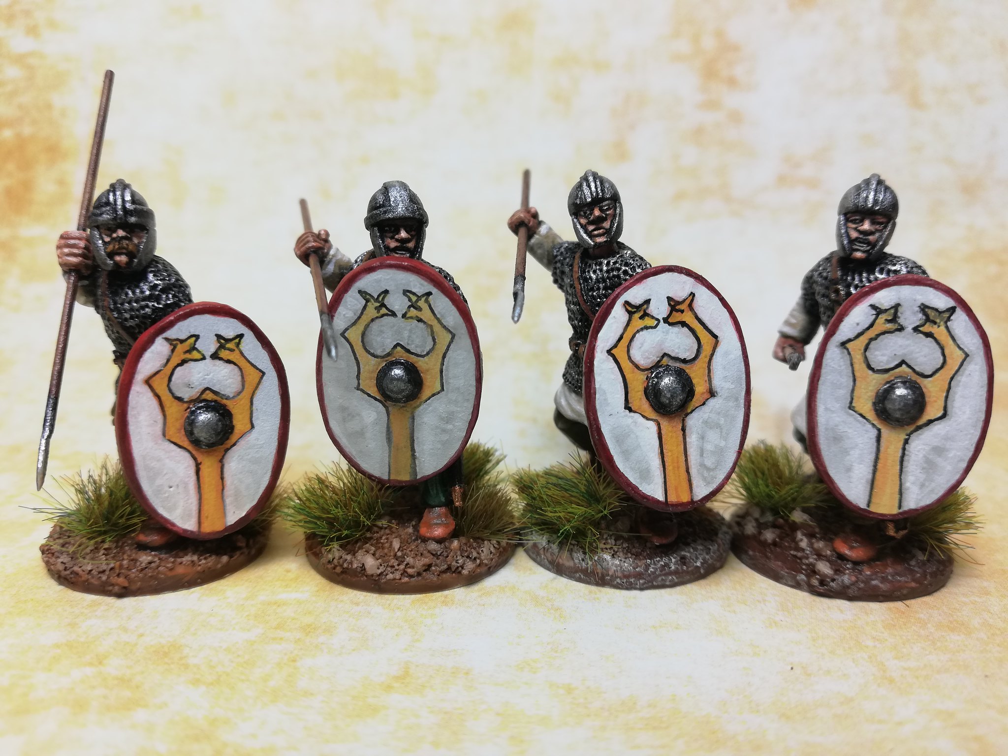
Here are the desperate dozen ready to face the long war of attrition with the invading Saxons.
For future reference, here are the colours I used, mostly Foundry and a few Vallejo:
British Warriors (Footsore Late Romans)
Armour & Weapons - Gunmetal Grey, Oily Steel, Silver
Hair - Black
Moustache & Beard - Deep Brown Leather
Belt and Pouches - Deep Brown Leather, Quagmire
Scabbards & Straps - Wine Stain Red, Black / Deep Brown Leather, Chestnut
Scabbard Tips & Sword Hilt/Butt + Buckles - Bronze
Shoes - Tan
Trousers - Union Trouser Blue / Moss Green / Forest Green
Puttees - Buff Leather
Flesh - Foundry Flesh Triad
Tunics - Canvas with Bright Red stripe or Border and circles
Neckerchief - Bright Red
Cloaks - Ochre
Spears - Spearshaft
Leather Armour - Deep Brown Leather
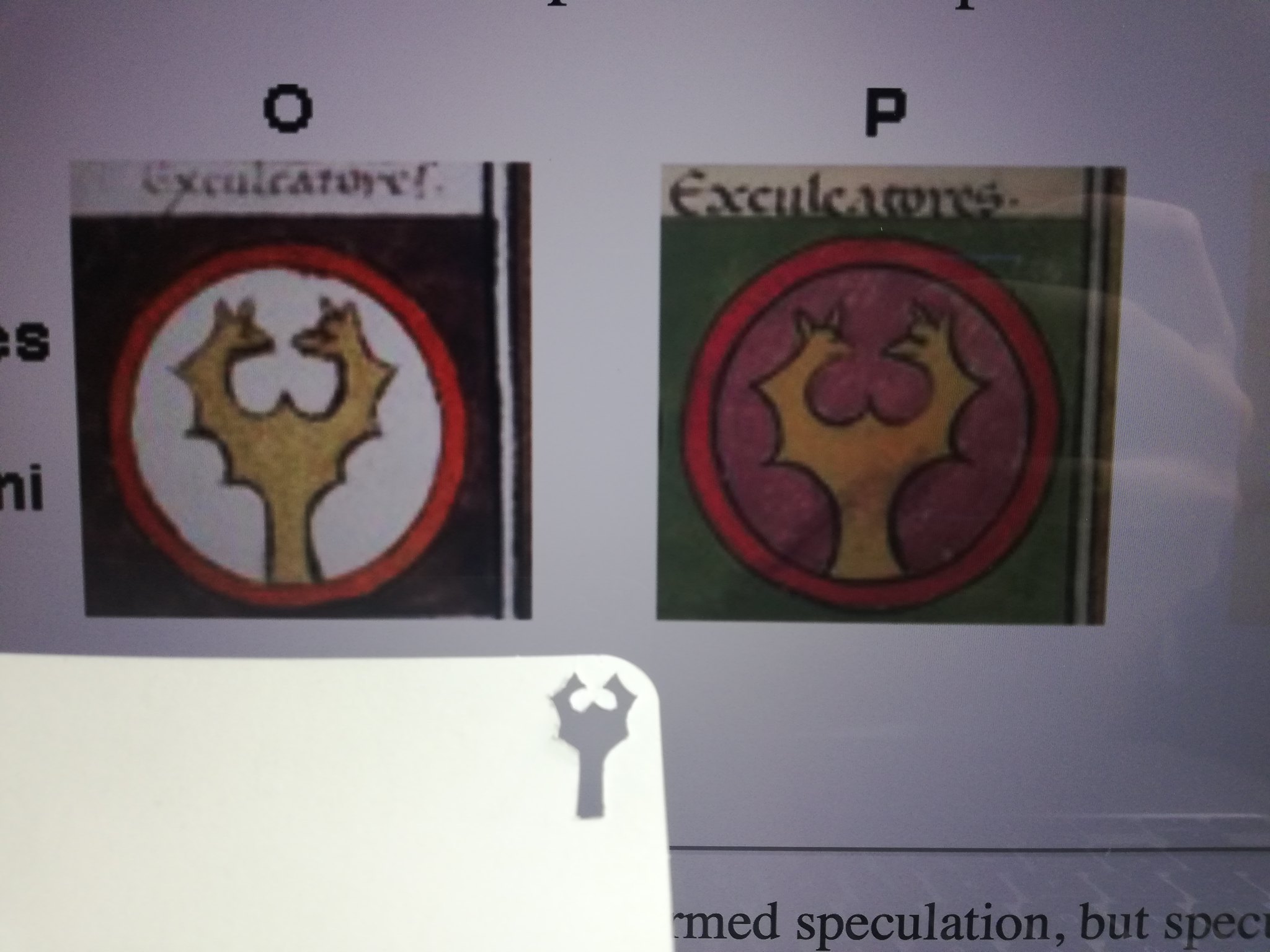
The shield designs are derived from the Notitia Dignitatum which lists the Exculcatores iuniores Britanniciani, though not specifically as a unit within the Comes Britanniae. I can't understate the value of Luke Ueda-Sarsson's site on the Notitia.
However, this particular shield design met my desire to have an historically plausible motif that featured white and red, reflecting what I understand were the common colours of that period. Epics such as Y Goddodin mention white shields. The WAB supplement Age of Arthur recommended red and white themes.
I nearly went the route of using LBMS transfers, but I wasn't keen on the red and white Chi-Ro designs on offer. After reading Bernard Cornwell's Warlord Trilogy I was keen on a less obviously Christian theme, though I won't exclude it entirely in the final force.
As it turned out I really enjoyed painting the design myself. Since the designs in the Notitia are depicted for round shields I had to adapt it somewhat for an oval shield.
The advantage of commercial shield transfers is uniformity, so I attempted to compensate by making a stencil from thin card. I should note here that there is speculation that the actual design may have been yellow and purple with a red border, but the Oxford version of the Notitia renders it as yellow and white with a red border. That suits me fine so I went with it.
I used the stencil to mark out the outline of the twin-headed zoomorphic creature with a micro-pen. I then blocked this in with Foundry Ochre Yellow for a warm yellow that would complement the cloaks on some of the figures that were also painted in the same colour.
I skipped a three-tone painting approach and just went for two tones. Since yellows are pigment weak I found it more effective to basecoat in yellow and wash selectively with the orangey shade tone to suggest texture and depth. For the white surrounding I based with Foundry Arctic Grey shade then outlined it with pure white.
The result was okay, but I decided to add more interest by painting white radiating marks around the yellow design to make it pop out more.
The shield rears are wood and were painted up in a three tone style with Vallejo analogues to Foundry Spearshaft with a wash of Vallejo German Camo Black Brown after the basecoat. I was more sparing with the highlights towards the bottom of the shield.
The red edging was done with Vallejo Black Red followed by Foundry Bright Red shade with less of the brighter tone applied towards the bottom. The nail holes in the leather were picked out with my homemade black wash based off Les's Washes. The central grip was my usual steel mix.
Mounting the shields on double-sided tape on top of card made them very easy to handle and paint the designs. However, once the time came to paint the rears it became rather fiddly because the handling and accidental scraping led to the paint on the front coming off or adhering to the card.
So I had to work quickly and carefully and I chose to varnish them with gloss then matte as quickly as I could. I may return at a later date to add more highlights on the rim but they look pretty good as is.
In truth, I was too impatient to glue them to the figures and finish off the bases with tufts and declare these two units of six done.
I'm pretty happy with them though I feel the black edging of the central design could be softer as it seems too harsh to my eyes, but it does match the design in the Oxford Notitia.
For my future batch of Late Romans I'll probably use the red and white emblem of the Cornuti since I already have the transfers and it thematically echoes the design of the Exculcatores.
Side note: The Exculcatores were probably light infantry scouts according to this, but I'm using them on heavy infantry. The specific colour combination trumps history here.
I have to say that despite the time invested in hand painting the shields it was so much more satisfying and enjoyable than applying transfers. And fun is what this hobby is about. I wonder what my next freehand shields will be.


